Katago supports score estimation, which is often a much more human-understandable metric than the winrate. Ie. a bot will think a 5 point lead is 99%+ while for a human it’s much less of a guarantee. Seeing that the game was within a 5 point margin instead would be useful. Similarly if you’re ahead by a lot, the winrate is unaffected by blunders while they would show up in the score estimate.
Or, in an even game a half point mistake can be a 90% blunder.
I’d assume that this would be a fairly reasonable change or addition.
Can you advise on where I can find documentation on this API, if I were to contribute the implementation of this feature? (Or else just dump whatever info is useful about the API into this forum )
/termination-api/game/${game_id}/ai_review/${ai_review_id} returns a json with all available review data. Coordinates start at the top left corner as 0-0.
updateHighlightsMarksAndHeatmaps should be the function which places the marks on the board. A substitution win_rate -> score should work.
As a noob, my games have win% graphs that sway a lot, and get stuck in the extremes.
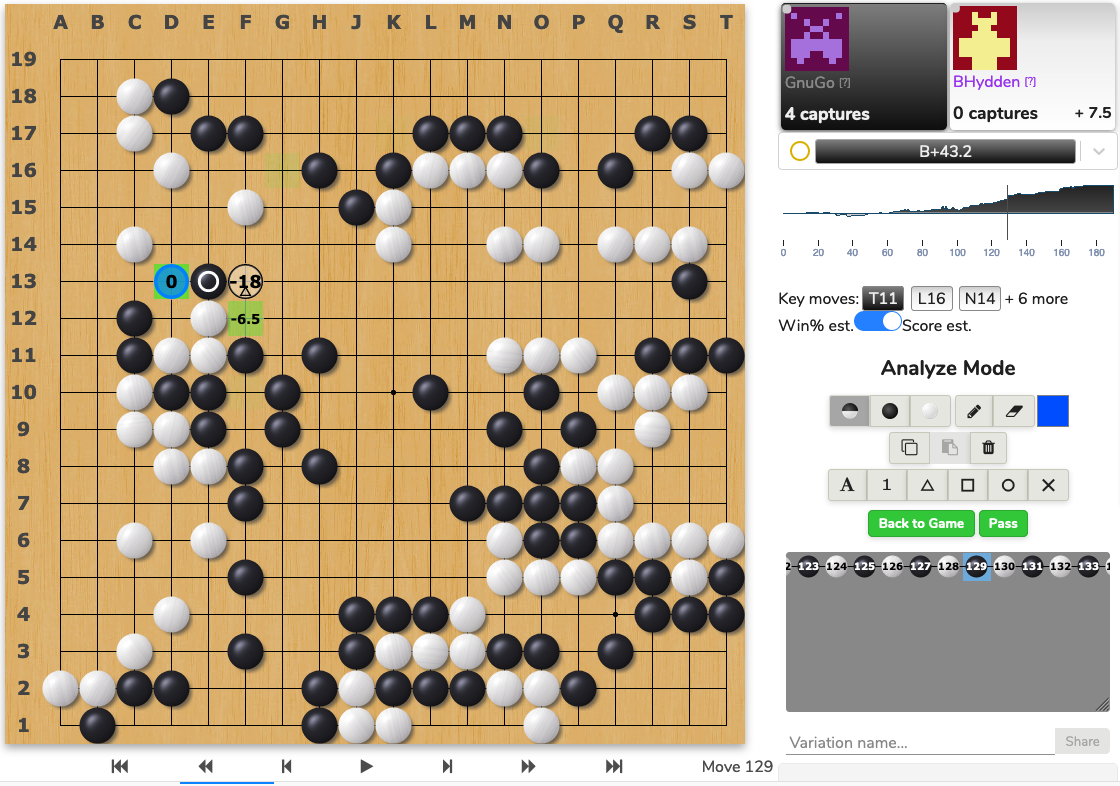
I wished we had the option to toggle between a win% graph and a score estimate graph.
Some might argue that score estimates don’t matter, but if I’m ahead by 40 points and make a -20 points mistake, I want to review it afterwards. The win% graph wouldn’t show anything because it assumes near perfect play from both parties, and being ahead 20 points is still a 99.9% win.
Hmm, is @flovo suggesting that this would be a pure typescript-react one-file feature? If so, I might actually take this opportunity to learn some front end and submit a PR.
Do you think the winrate in the bar on the top could show the current estimated score difference instead of the winrate when score estimate (mode/graph?) is on.
It’s just because neither the winrate or score estimate have a scale on the y-axis, so it’s hard to tell if it’s 10 points or 5 etc just from the graph.
Or maybe it could be a setting? It looks cool anyway. Especially useful when someone is at 100% solidly for a while.
If I might offer some tweaking ideas, I think some margin around the toggle would go a long way, so it does not stick to directly to the surrounding letters and buttons.
Also some sense of the “scale” of the graph might be very usefull. Where it’s touching the top, is it +50 points?
 )
)