Josekle Development

Layout Experimentation

I’ve been experimenting with a simplified, and hopefully improved, method of automatically laying out the Josekle page, while remaining responsive and filling the window.

As many may have already noticed, Josekle automatically toggles between landscape and portrait modes, depending on the aspect ratio of the window you are viewing it from. If you have not seen this, trying rotating your phone or resizing your browser window.

However, the current behavior does not handle almost-square aspect ratios very well, and there was an odd layout bug when switching from landscape to portrait mode specifically from viewing it as page is “added to the home screen” (at least on my phone).

Hence, I’ve been working on some updates that are now live on my development fork:
https://yewang.github.io/josekle/

Please check this out and let me know if you run into any issues. On mobile, please also try adding the page to the home screen and testing if the layout responds well to rotation.

If you want more details and wish to consider one final remaining layout issue, click here to view.

Reference images

Note: these all show the cases for almost-square windows. Most users might never encounter these.

The familiar layout for more rectangular windows should remain largely unaffected.

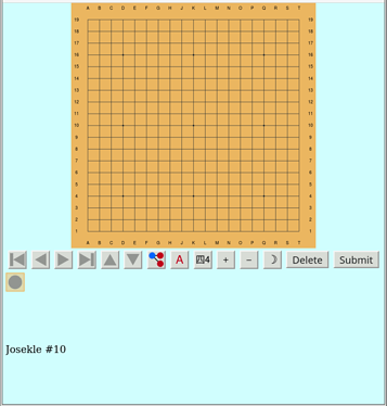
For reference, here is how the old version (still live on main) treats windows that are almost-square:

In landscape mode, to avoid squashing the panels, the entire interface is shrunk leaving empty whitespace (which is especially jarring for dark mode):


The overall page background could be colored in, but it’s still inefficient usage of space.

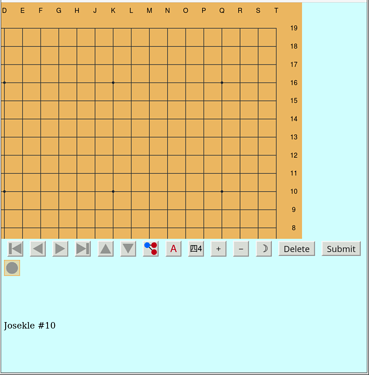
In portrait mode, no anti-squashing is performed, but the control, tree, and hint panels do not have enough room to be usable:

Here is the new behavior for almost square windows

When the board is fully zoomed out, it is shrunk to leave enough room for the control panels


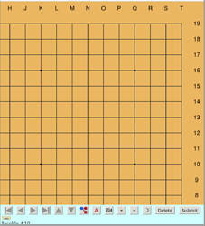
However, something funny still happens when the board is zoomed in and the window is almost square:


The board display generator is actually cropping the viewbox to less than what is shown. Somehow portions of the SVG outside of the viewbox are revealed. Actually, since the viewbox is zoomed in on a square region, it’s not terrible to display some more information outside of it (and making the board display rectangular overall), since the space left for the board is rectangular. However, it would be more efficient to align the SVG with make use of the remaining margin (to the top in landscape mode, and to the right in portrait mode). I’ve been trying to fix that, but have not figured out how to get the CSS to properly style it. Any input is welcome.
2 Likes

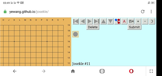
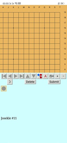
Opera/Android
Seems the cropping is tougth
(Wekk i don’t use this orientation myself)

1 Like

If you drag up (on the blue region) to scroll down, does it hide the address and navigation bars to give more room? Or does that not work?

I hope the portrait mode is okay?

1 Like

Yes

1 Like

1 Like

Thanks for sharing those screenshots.

I think this behavior is an overall improvement. I noticed that with the previous version, it’s not quite possible to get rid of the address bar (when viewing from a standard mobile browser interface). So at least with being able to scroll the page down a bit to dismiss it, it gives a bit more space to the interface, and one can still access the address bar by scrolling back up.

1 Like

I definitely agree that we need something like this. For me, the trickiest thing is figuring out how to properly make a pop-up like this. I’m a bit of an amateur when it comes to this web development stuff.

However, here is a short blurb of help text to potentially copy-paste, when sharing, and maybe eventually work into a built-in help dialog:

By the way, thanks for sharing all of that awesome feedback!

3 Likes

That text is good
The button should be in UL corner but well, out of context. So maybe at right of submit LR? (It’s about ppl reading a screen in diagonal)

1 Like

I messed around a little with the old version and think I saw the issue you’re talking about, and it’s fixed in the new version, at least in my phone (ios)

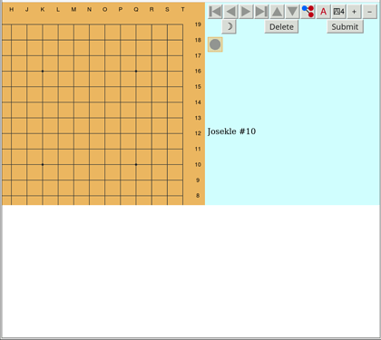
on my ipad I saw this, feel like the layout could be tweaked. but I don’t think it’s high priority…

#10 spoilers

you can scroll the list of guesses but only that little area

CSS stuff like this is black magic as far as I’m concerned

1 Like

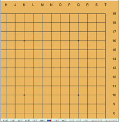
Something like

?

2 Likes

I think I need to play with the minimum panel height and width values a bit, which I think could resolve that. Currently, it is just 250 pixels, which is clearly is still not enough. Maybe a dragger to set how much space is given to the board vs the panels would be nice, but I have no idea how to do that.

Yeah, it’s tricky stuff. Actually, my solution is still not that elegant, since it involves using a bit a JS code to add a window resize listener that queries the view dimensions and sets heights and widths manually.

Ideally, it should all be done in CSS, but I’m not sure how to actually do that. A particular stumbling block is that we have an SVG board image embedded in the page, and that behaves in a way that I don’t quite understand with regards to CSS layouts.

Thanks for tip, @shinuito! I’ll try that out later.

3 Likes

I think it may be good to clarify somehow that a purple white stone could actually be black in the solution, but I’m not sure how to say this in a clear and succinct way.

2 Likes

How about this?

Purple means that the point is in the sequence, but not at the right timing, and may be a different color.

2 Likes

It’s much harder to explain clearly than I thought :sweat_smile: I had some other ideas but discarded them because they’re not really better.

only thing is I would just add “stone”:

Purple means that the point is in the sequence, but not at the right timing, and may be a different color stone.

since there’s already colors going on too

2 Likes

“But the timing and/or som stone color are incorrect” is a succinct way to put it that a few folks have suggested elsewhere

Edited to specify “stone color”

3 Likes

Oh, wow, I didn’t think about the dual meaning of “color” in this case.

One of these hints is always lying, while the other only tells the truth…

2 Likes

Also what about including images in the explanation? For example:

  1. Guess the hidden joseki by submitting move sequences.
  2. Green :green_circle: indicates that the move is at the correct place and timing within the sequence.
  3. Purple :purple_circle: indicates that the point is part of the sequence, but the timing and/or stone color is incorrect.
  4. The red :x: indicates points that are not part of the joseki.
  5. A new puzzle is available every day!

(But instead of the emojis, using images of the empty circles)
Or maybe including both the emoji and the image, so that red x = white circle is clear?

3 Likes

Do you think passing/tenuki should ever be included? That would allow for double approach joseki

Edit: on second thought this might make it nearly impossible to solve, if people don’t consider the option. Might make the puzzle too frustrating

3 Likes

You can kind of get them with a 3 space pincer. Not exactly the same but still

1 Like

Want to make my pedant here… Not the same to have that pincer stone. Or i will never pincer again…

2 Likes