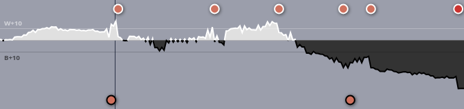
Here is the chart from a humiliating defeat I faced today.
Due to the massive endgame swings in the game, there’s an illusion that the game was nearly even for the first 140 or so moves, but in fact it was quite dynamic, with white or black being up by upwards of 20 or so points at various moments in the game.
Many games can end with one player up by 70+ points before their opponent resigns, or if the players decide to take the game to counting. When this happens, and the early game swings get blown out of proportion, early- to middle-game mistakes become more hidden, which makes the graph less informative to the players.
I propose rescaling the axes in a way that dampens the size of the effects the further out the score goes from the medial line. The idea is to have the axis reflect the relative size of the point swing (when you’re down by 50 points, a move that loses 10 points isn’t as significant as a move the loses 10 points in an even game). Going with sqrt(point advantage) is just one idea; there may be other contenders. Note that the numerical value of sqrt(point advantage) wouldn’t actually be displayed anywhere in the graph. The same point advantage should still be shown; there should just be a transformation that pulls the swings a little closer together.
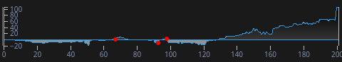
I believe ai-sensei.com does something like this already. Here’s the same game with its advantage graph. I think the presentation here is a lot more informative.