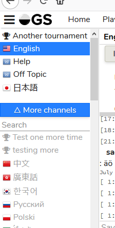
@anoek did you mean to remove the feature I added to be able to go to tournament and group pages from the chat name? worked hard on that feature and I’d be sad to see it go 
It’s there in that toolbar menu, if you’re about this one.

I guess from your standpoint, you wouldn’t want it to be hidden.
I can only see that toolbar on the live server, not the beta? ![]()
OHHH that one… ok found it thanks
grumbles about it being one click further away than his own implementation
ok yeah I guess that will do ![]()
no, I suppose I wouldn’t ![]()
![]()
What does ‘open games’ mean in the filter? Is that like ongoing games? I would’ve thought they were all ongoing?
Hm, maybe a bad choice of word - it’s supposed to mean non tournament non ladder games
It does seem like a hard one to word. Obvious ‘other games’ would be a bit too nondescript. Maybe something like ‘challenge’ games. I know technically a ladder is also a challenge game, so its also a bit hit or miss wording.
Actually quick question, are ladder games the main site ladder or the group ladder when they’re being filtered?
Ladder games will mean all ladder games on main, and group-ladder games on group pages
I joined the Betazoids group just to see how groups work and there’s a group ladder game being filtered as open and not ladder is why I ask.
Ah minor note, all existing games won’t be categorized correctly, only new games.
Bot games should be turned off in filter by default. So human games will get more viewers.
Well, the path I started down was to replace the group page all together with a hybrid chat / group page thing, so yes… but now I’ve abandoned that because I couldn’t make that look right. I had the group link in the drop down where the games are now, but it looks funny there too. Basically, I don’t know where to put the link anymore.
Actually when there’s too many games it reverts to a list. It’s at 11 for me (I think by default) that it reverts to a list, and it’s controlled by your ‘Game thumbnail list threshold’ in general settings, where you normally set it for your home page. (I was playing with this)
I didn’t notice it before, but there’s (now) three separate places that that setting affects, your home page, the ‘Games’ where you normally could find games to spectate, and now the chat list that shows thumbnails/lists of games. Should these be separate options or?
Actually even stranger @anoek it looks like the Games show input box is tied to the show input box in chat. When you change one it automatically changes the other one.
I guess if you planned to removes the Games page, that wouldn’t matter too much. If not it’s probably inconvenient, as maybe you don’t want to show too many games when it’s part of the chat screen (you probably want to read chat) but when you’re on the games page, the whole page is dedicated to that. (I can understand the filters carrying over)
I just noticed that top-bar gets cut off if it doesnt fit neatly on one line. Not sure how big problem it is, but i guess its still worth mentioning/complaining about xD
See below the english and finnish version on 13 inch screen, finnish version doesnt include link for profile:
Easy fix is zooming out little bit in the browser, with 90% zoom on chrome finnish version has the profile link too:
Alrighty I fixed and incorporated almost everything here I think. I also added the ability to filter by game progression (so beginning, mid, end of a game).
I’m digging my hole here, but isn’t there a whole discussion about when a game actually enters mid- and endgame?
What am I missing?
Probably, but I tend to just plug in some numbers and wait for people to get opinionated 
Current values:
9x9:<20 beginning, <40 mid13x13: <30 beginning, < 60 mideverything else: <50 beginning, < 100 mid- 9x9: < 16 beginning, < 32 mid
- 13x13 < 34 beginning, < 68 mid
- everything else: < 72 beginning, < 144 mid
The board sizes scale faster than you think. An ideal 9x9 game can end before move 30, and many 19x19 games top 300 moves. I suggest the guideline be 1/5 and 2/5 of the total area (still arbitrary, but maybe closer):
- 9x9: <16 beginning, <32 mid
- 13x13 <34 beginning, < 68 mid
- everything else: <72 beginning, < 144 mid
Cool thanks for that, I had a feeling 9x9 was a bit too high. I’ll update the numbers for all three to what you’ve got
It still exists in flovo’s chat notification doodad, that shall have to suffice I guess.
It does not seem you implemented a way to hide group list and user list on desktop view?
Why no one is complaining. It’s much better to complain now before it’s all on the main site. Come on, let’s get some complaining going on.
Even if you think everything’s fine, perhaps it’s useful to throw out new ideas.
Looks very nice now, margin and sizes look pretty good.
- I’d like to be able to leave English channel. Currently on the main site I’m not in English channel.
- Thin chat header is nice but when you edit topic input field is too tall. Input field should fit nicely into header or not?
- Currently buttons to show games and some others are a little too tall and they don’t fit into header, should be smaller, probably.

- I found a funny quirk. If I set custom background and stones, preferences menu is long enough on my screen to enable scrolling and it’s possible to scroll the toolbar off the top if the screen, hehe.
- The button with three big dots looks weird. Am I only one?

Like an alien looking at me. Perhaps a label would be fitting?

And I’m not sure about this, but margins look a little big again around the button.

How about we make the Search field connect directly to the button. As if it was dropping down from the button?

- I think it would be useful if the edit button and leave the channel button switched places.
Because it makes more sense for the edit button to be close to the edited text. Currently it’s way too much space between. And cross on the right would make sense because leaving channel is a rare action so having it away on the right is ok (in my experience the cursor is usually on the left side of the screen on chat page). (I must admit, I pressed the cross accidentally several times when playing around on beta, I think I wanted to cancel topic edit or something). - Here’s better idea. Replace the cross with a cog. And when pressed show that menu with tournament page and stuff.
Although this Leave Channel is not the same as Leave Channel in top-right channel notification menu? I’m a bit confused about this.
Anyway, this is my brainstorming.


