The colors of those little filled online status circles in the game view (in the left upper corners of the players’ icons) are difficult to distinguish for colorblinds like me (deuteroanomaly, green-weakness).
Could you please choose colors that are much more easily to distinguish for everybody, with more contrast?
Thank you in advance.
14 Likes
Do you happen to have any recommendations for better color choices?
1 Like
Yes.
Offline = white or a light grey
Online = blue
Blue is perfect for red-green-colorblinds.
Thank you.
5 Likes
Other options to consider would be to move the indicator to the top-right so it doesn’t merge with the avatar, or maybe use a filled circle for online and an unfilled circle for offline so that there is always a noticeable difference in appearance.
9 Likes
Just generally bigger and more noticeable please. Thanks for raising this @stephan_ro
6 Likes
Yeah - I’ve been aware that the whole red-loss green-win thing is an issue as well…
3 Likes
Speaking of making things more noticeable:
I would like a bigger “there has been a move in another game” indicator.
Or maybe just the words “online” or “offline” instead of signs, circles etc.?
1 Like
I would be very grateful if someone could program this tiny change for us colorblind people.
Blue for offline and green for online would be great.
2 Likes
I would really be glad if someone capable would help and change the colors for us color blinds. At least for the little online status indicator.
2 Likes
One demotivator for fixing this is that the online indicator has become unreliable since the introduction of other clients (phone app for example) which don’t honour the APIs needed to get this right.
I’d rather see that fixed first.
(Colour blind people are saved the frustration of seeing moves played in their game by a person with a grey presence indicator due to this stuff happening  )
)
1 Like
I see. — Well I just thought it should be very easy to change the color…
It is in fact not too hard to change the color to blue. You would just go in the codebase and change instances of #33FF33 (green) and #6f6 (slightly lighter green) to your favorite shade of blue:

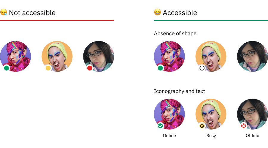
But from a design standpoint, I’m not sure this is what we want to do. There are, after all, blue-yellow colorblind people in the world as well. I think there are some color-independent changes that could be more ideal, but would take slightly more work. I liked @opuss’s suggestion of a solid circle for online, empty for offline for example.
Here’s a nice article on the subject: Designing for colorblind access. Part 1: accessible UI components | by Alex Chen | Queer Design Club | Medium
6 Likes
Blue empty circle for offline, and solid red circle for online could probably be near optimal then.
1 Like
You can check for a good contrast here:
That is true, I’ll give you that.
Maybe we’ll do it and you can join in asking for the actual function to be fixed
1 Like
@stephan_ro here’s a quick way to change it to blue if you can install a Chrome extension.
- Install an extension allowing custom CSS such as Stylish
- Add this CSS (copy it exactly) applying to URLs on the domain
online-go.com:
.MainGobanView .players .ChatPresenceIndicator.online {
    color: #66f;
    text-shadow: -1px -1px 0 #aaf, 1px -1px 0 #88c, -1px 1px 0 #88c, 1px 1px 0 #66a;
}
5 Likes
Oh, that is interesting. Thank you. I will try that soon.
1 Like
I’m exploring making a full theme for accessibility.
Is there already and obvious choice-basis from “light” or “dark”?
IE is one of those two clearly the winner for accessbility, and the other would never be used?
Or will we ultimately need light-accessible and dark-accessible?
Thanks.
3 Likes
I committed a prototype in case anyone is up for messing around with the details.
This prototype just does the work of adding another theme and being able to switch to it, plus makes the online colour blue.
3 Likes