Then there is the emblem of Mozambique, which features the AK-47 as a device

Then there is the emblem of Mozambique, which features the AK-47 as a device
Fun fact: the Irish government has been advised not to register images of the Irish harp, the national emblem, facing right in case they infringe Guinness’ copyright.

Another flag that I like

First councilman: So, a nordic cross?
Second councilman: I’d prefer a saltire…
Third councilman: Let’s get a rising sun like Japan-desuuuuu~
two hours later
There’s even an entire wikipedia article about “Socialist Heraldry”
Clearly the emblem is asking for upvotes on reddit
There are some very obscure flags in England that give no indication of where they are in the world.
This one that looks like an unrecognised Communist breakaway state in Latin America? It’s Nenthead, a village in Cumbria.
Remember the time I made flags for DipGo?
The Cingdom of Cochineal
Right Side Alliance, first and second flags
Another variant of the flag.
The identity of the “cuckoo clock” is apparently under debate. Some scholars believe it to represent the gate of Mecca, but others suggest it to be a funeral monument.
So this thread popped up recently:
And it got me thinking, I really do like these fun flags that aren’t directly tied to (modern) nationality. Anyway thought we could share fun flags in this thread.
A couple Korean flags to start:
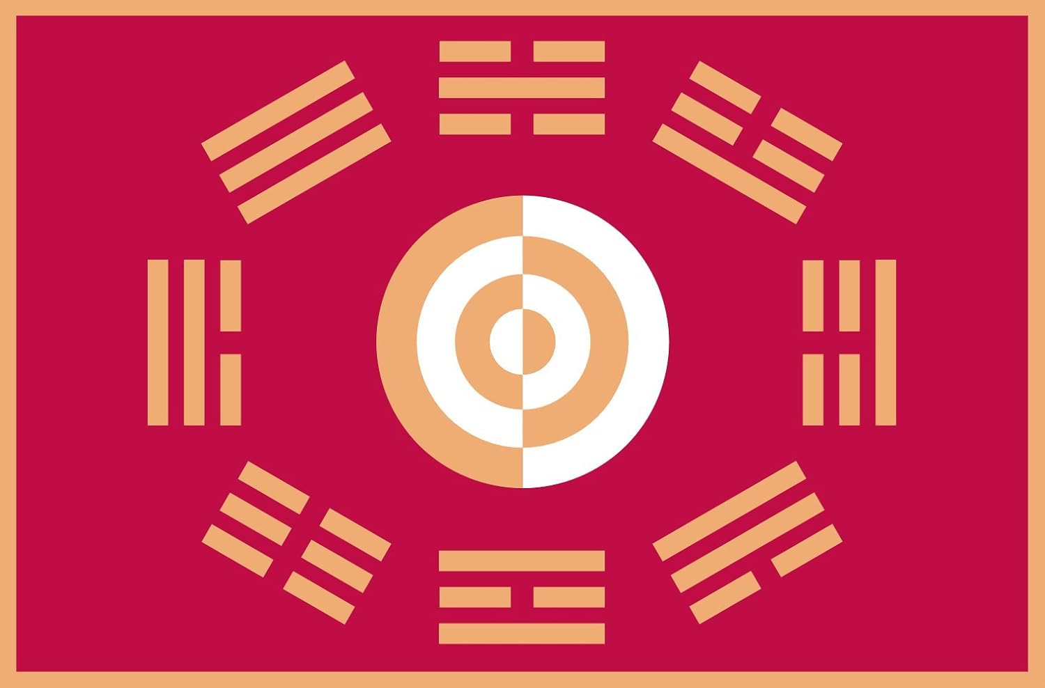
The joseon flag. Echoes of this one in the modern South Korean flag, but it’s worlds different now.
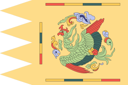
Goryeo Dynasty Flag: that bird is the Bong-gi (봉기/鳳旗) often translated to Pheonix, but not really the same thing. Still a magical bird-like creature.

Flag of the Workers party of Korea. Everyone knows the hammer and sickle, but have you seen the hammer and sickle and brush??? ![]()
I don’t know many, but this is the flag of my ancestors ![]()


Does it belong to Rome? Reminds me the football team with its colours, also a wolf feeding babies in Football team’s flag.
No. Malatesta family dominated a large part of Italy but never Rome, which belonged to the Papal States.
Your name is also so cool
")
 | Napalm Records")
Shouldn’t a thread about vexillology be flagged?
![]()
Nothing new under the sun.
It has been flagged and now moved to another thread, so everything seems to be working exactly as planned.
My observation about crests:
Recent turbulence → fancy symbols, art deco feel, patterns
Recent calm → original colour palette reduced to 2-3 primary colours, old symbols reimagined in flat design
Frequent shuffling → same crest as always, different pantone tint, curves turn to lines


