I d rather read more from different uses as to fix with the limited answers we have yet.
2 Likes

Yeah I don’t feel like the graph is really needed on a landing page. If the landing page is focusing on a couple of keys settings for players to get games, or a place they can look for their challenges and so on, better to leave the graph where it is on the play page with more options there etc.
If it’s supposed to convey how many games there are or offers there are, one could just show a simple number ( players online, live games being played or whichever)
6 Likes
I agree and would add that this graph is not the type of thing you want newcomers to see when they land on this website. I still find it hard to grasp, and for newcomers I’d guess it screams “complicated/nerdy/not-fun”.
Regarding correspondence: Couldn’t we simply display the 6 most urgent games, with a button to open a dedicated page to list them all ?
Regarding challenges : I agree with @espoojaram that it seems weird to have challenges both on the left and on the bottom. I’d probably remove those on the left. It could be used for other things, such as latests posts on the OGS Forum to foster the community.
1 Like
I’d like to see upcoming notable tournaments, both live and correspondence. Especially since the  icon got banished from mobile
Seeing where I left off in e.g. “Fran’s Library” would be great!
1 Like
I’ve been considering this idea, but I don’t know if it would be a hassle to implement or slow performance down. But since the last few replies have been moving in this direction a little bit, I think it’s worthwhile to bring it up.
Basically, what if we allowed some degree of “modular customization” of the landing page (with pre-designed templates of course)?
For example, users could be able to choose the layout from a few templates:
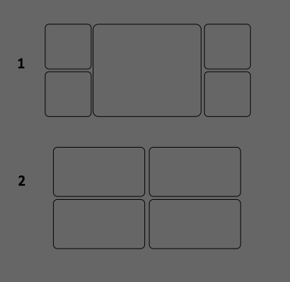
(just an example)
And for each one of those “modules”, there could be a little drop-down menu in the corner to choose what to show there.
So if a user wants to have the lobby graph, they can have it, if they want to have a puzzle widget, they can have it, etc.
Having an option for Go world news, or other things related to the Go community, might be cool for a lot of people here on OGS.
Basically we could survey people on what they’d like to see, and slowly start building the modules.
And of course, for newcomers we’d just show them a chosen default with what seems reasonable, and let them discover the customizability by themselves, or through the community or by reading the wiki.
I mean, not draw too much attention to it to avoid overwhelming them 
Another idea might be to have a message pop up in the landing page if the user starts playing correspondence but still uses a live-oriented page, like “Hey, did you know you can see your active games here?”
What do y’all think?
What about watching games? I watch regularly this week top of list and we are over 10 watchers each time.
I dunno. That landing page can be a reminder or an invitation to discover all what OGS can offer.
2 Likes
I think the focus for now should be on the “default” landing page; further modular customization is a good idea but may be added later on, progressively. Currently we have no customization either, at least having a good default landing page would be progress.
Unless it’s very easy to do all at once of course, I don’t know enough to judge how much work that would require. I’m just afraid nothing will ever be ready if we just keep piling on more and more stuff.
3 Likes
Yeah, it’s just that it seems clear people here have a very high variance of what they’d like to see in their landing page – it might be easier to convince everybody to agree on a solution if they feel that they’re not forced to compromise their own user experience
1 Like
I forgot a few important things to put
Under which account (and rating maybe?) You are log in (for the afficionados of multiple accounts)
Announcements.
(the nav bar doesn’t need to disappear, it’s not shown in Clossius’s proposals but I think it should stay there)
I would urge Clossiues to NOT think about giving players any type of freedom in choosing their dashboard in the alpha version of the landing page. Don’t even start thinking about. People don’t realize how impossibly hard it is to add any type of settings and figure out edge cases. Just do your thing, implement your vision, and don’t make the page too crowded - and that already would be a MAJOR value for the whole Western Go community. You are single-handedly designing a product with a specific goal in mind (playing Go), not a Photoshop that is a over-bloated toolbox.
3 Likes


I’m skeptical on the ladder inclusion. I don’t think it works well or that many people use it. I’m not advocating removing it from OGS, all ladders would still be accessible as they are today, but with regard to the landing page is it really the most important/interesting thing we could use this space for?
I’d prefer for example the current top post of the forum (which would double as a link to the forum and highlight this community to newcomers).
Then again maybe it’s just me with this opinion, I don’t have data to back it up.
Edit: as another suggestion, I would remove the “profile” button on the right. I assume your account will be displayed in the top right once logged in, and clicking on it to reach your profile seems both standard design and consistent with current OGS design.
4 Likes
It looks really nice, I like the lichess-like design and only one time option per board size. However, the 13x13 size should not be removed and not just because I personally like playing it. I usually find a game faster on the 13x13 queue than on the 19x19 queue, so at least at my rating (9-10k) it seems to be quite a popular option. It’s a faster game, but still feels like go whereas 9x9 feels like a different game.
2 Likes
This is a very interesting observation. I always assumed that 13 is rather the poor relation of board sizes although I do like it. If it is fact pretty popular then surely it could be squeezed in.
I think 13x13 is certainly a lesser-known game than both 19x19 and 9x9.
When I played on GoQuest, a server devoted specifically to 9x9 and 13x13, there seem to be a lot more 9x9 games played than 13x13; and I quickly reached a higher rank on 13x13 than on 9x9 for the simple reason that most people suck at 13x13.
I mean, there are players who played a lot of 9x9 and got very strong at 9x9. But most players seemed to underestimate the interest of 13x13 and they played moves which felt “imported from 19x19” and made very little strategic sense on 13x13.
I think all three sizes are extremely interesting, but 13x13 is the least-known of the three.
1 Like
It might be the least known but if there are more people trying to automatch with it then 19x19 I feel that’s an argument to retain 13x13 automatch.
Idk but what if there is a great wave of people who are beginners, play bots and such at 9x9 (and don’t use automatch that much) and then decide they can “progress” to 13 and use automatch to find games usually and then "progress"to 19, at which point they prefer to make custom challenges or something.
It’s not inconceivable that 13 is least known but most automatched!
5 Likes
13x13 is quite appropriate for a game on a phone.
4 Likes
Setting aside whether it’s more or less played, I agree that 13x13 is a standard size which would deserve a spot next to 9x9.
Perhaps we could either move “Custom” to a separate button to make space for 13x13.