The dilemma is each colour combination is going to look different, not only to each set of eyes but on each monitor also… no way to please everyone
if you try to please everyone, you wind up pleasing no one.
I also didn’t vote because I wasn’t clear on what the options would deliver. I hesitated from saying that, because it would make more work for you to clarify :o
(Ideally we’d vote on mockups).
I haven’t forgotten that this question is here, I just need to find a moment to carefully read where the discussion has got to.
Personally I do think it needs to be fixed, but I’m aware that I might be the part of everyone that ends up not pleased.
I think it is a “nasty fault” to be using colour to mean something, and then not have the apparent-same colour for that thing … to use clearly-different colours for the same thing on the same page: I think that this is a bad compromise for the sake of accessibility: making the meaning less clear to 80% of the world to improve it for 20%.
I know that it is easy to say what’s wrong, far harder to come up with the right thing. I am thinking about that, but would also welcome clearer choices put forwards if there are some.
Hmm… I don’t think we’re quite at the point of his disassociation just yet, but it is indeed a direction to be wary of…
I was responding to your comment that you think that the gold and poo brown in dark mode match well, and to benjito’s comment that unless there was a strong indication from users, he’d leave it the way it is.
In catching up, I found this one. This works OK for me - the colours look the same. If that’s one of the choices, I vote for it ![]()
I can see that the contrast is not that great on the light background - I wonder how this compares to “how it was before” (where the colours also matched and the contrast was not that great)?
(All the above being said, one thing for sure: monitors do make an astonishing amount of difference. On my desktop monitors at home, I was thinking that you’d have to be blind to think that the brown and gold match. However, on the monitor I’m at this morning I can see how the brown was arrived at - it doesn’t look “too bad”. Just goes to show how truly difficult this is!)
The answer is marginally better. ![]() contrast checker says 2:1 instead of 1.6:1
contrast checker says 2:1 instead of 1.6:1
Yes! Option 3! (Which @Kosh and I voted for as well)
Maybe see comment #71? I didn’t get much of a response for that one either >.< But yeah, ideally the vote would happen with the mocks all in one place, but forums isn’t a great medium for this.
I don’t understand what this comment is referring to ![]()
I prefer the term Pirate Gold! Joking, but if we’re talking web colors, the closest equiv is probably dark goldenrod, so still on the outskirts of gold territory.
It was referring to the dark and light gold being so far apart that people think they represent different colours entirely.
Oh thanks for clarifying. I thought since you said “his” you were implying I was disassociating (from reality?) Likely due to the mind-shattering realization that the perfect design may not exist 
Sorry that was a typo haha it auto corrected disassociation to his association and i corrected the second word but missed the his 
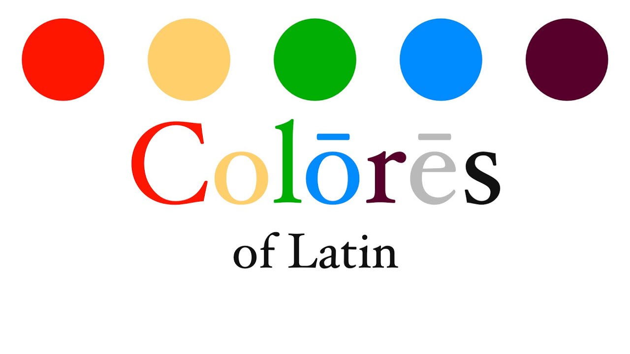
With all the discussion here of what is “gold” or “brown”, I thought someone might find this video interesting. I’ve timestamped it to the discussion of shades of yellow / gold / brown.
[Colōrēs Latīnē (Colors in Latin) - YouTube is the same video but entirely in Latin]
Love those! Where are they from? They look to be reminiscent of what I’ve seen on chinese art.
Haha well yeah they are Chinese! I don’t actually know much about them though, I’d like to know more myself. I think it might just be stylized characters…
I think they are hanko 判子, aka signature seals or “chops”.
To quote from Seal (East Asia) - Wikipedia –
A seal, in an East and Southeast Asian context, is a general name for printing stamps (…) used in lieu of signatures in personal documents, office paperwork, contracts, art, or any item requiring acknowledgement or authorship. (…) China, Japan and Korea currently use a mixture of seals and hand signatures (…)
Chinese seals are typically made of stone, sometimes of metals, wood, bamboo, plastic, or ivory, and are typically used with red ink or cinnabar paste. (…) In Japan, seals (hanko) have historically been used to identify individuals involved in government and trading from ancient times. The Japanese emperors, shōguns, and samurai each had their own personal seal pressed onto edicts and other public documents to show authenticity and authority. Even today Japanese citizens’ companies regularly use name seals for the signing of a contract and other important paperwork.
While the specific ones I posted look like seals, I think the general symbols are for good luck and appear in many places besides seals. Here’s an article on the “double happiness” one:
Edit: also an article on the longevity character:

